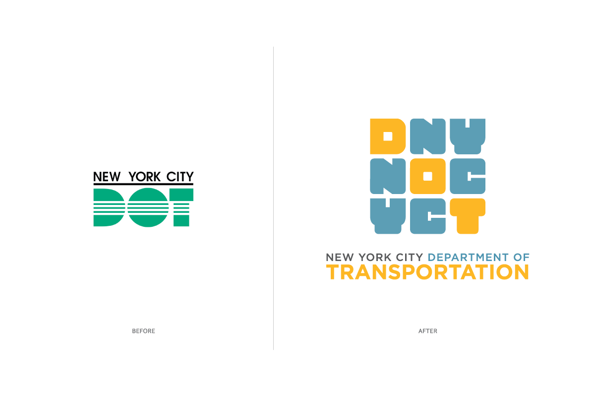
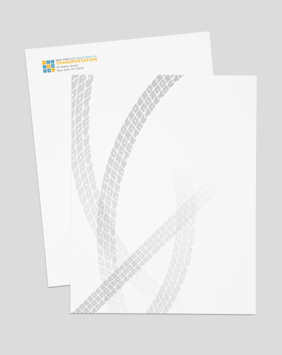
The largest municipal transportation agency in the United States, the Department of Transportation of New York City provides a safe, efficient and sustainable means for people, traffic, and goods to get around. It contributes to the community’s robust economy and to the well-being of both its residents and visitors. To reflect its human-centered values, the agency needed a new identity that expressed warmth yet looked contemporary.
We honed in on the fact that the agency, by maintaining the city’s transportation infrastructure, makes it possible for people not only to reach their destinations but to interact and connect with one another.
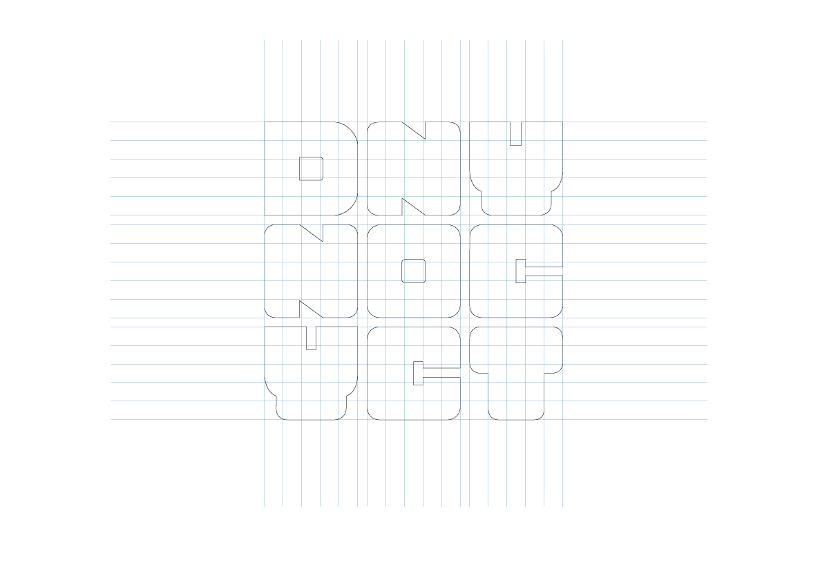
We were inspired by the grid system on which the bustling metropolis was built—the largest and arguably the most famous grid street plan. Imposing order but also facilitating movement and connection, the layout was and remains vital to the development of the community. The grid perfectly encapsulates the city and the agency’s role in shaping it.
The color palette takes its cue from the orange and blue of New York City’s official flag, which is flown in parks and at buildings owned or occupied by city departments and institutions. To extend this symbolism of connection through order and pathways, the logo is drawn based on a grid.
