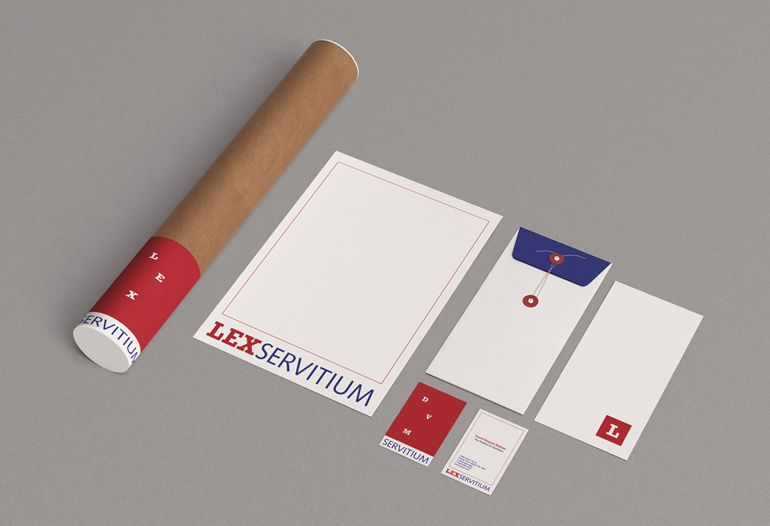
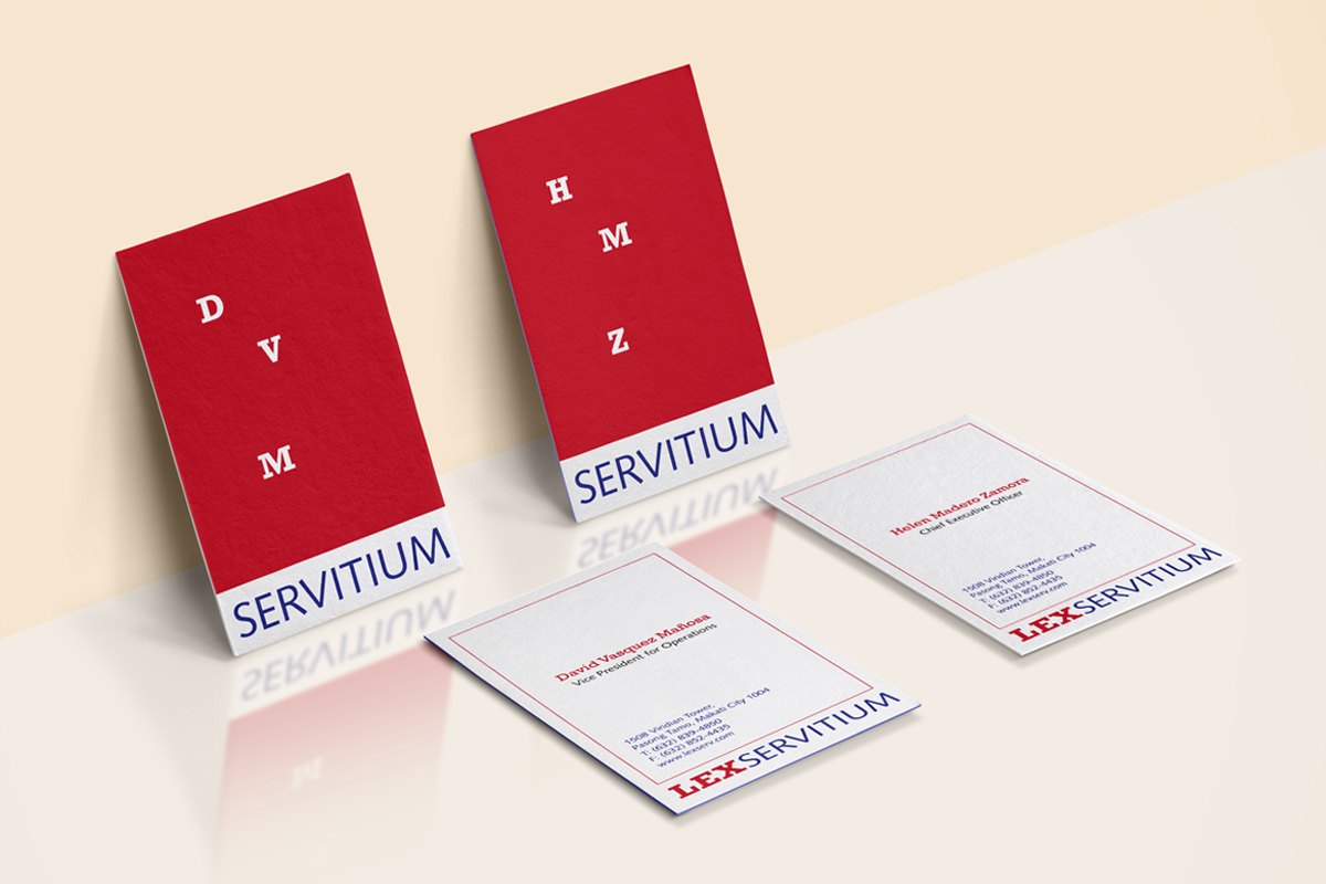
Lex Servitium, which is Latin for ‘law’ and ‘service,’ is a new player in the Philippines’ business process outsourcing industry. They take routine work out of the hands of law firms, corporate legal departments, and other organizations by providing support such as document review, legal research and writing, and transcription services.
To carve its niche as one of the first legal process outsourcing (LPO) firms in the country, Lex Servitium wanted an identity that stood out and clearly reflected their services and strengths, which is bringing clarity out of apparent disorder.
We saw parallels between Lex Servitium and court reporters or stenographers, whose work is to transcribe spoken or recorded speech during court hearings and other official proceedings from shorthand into official transcripts. Similarly, Lex Servitium transforms specialized information into something that could be useful to many.
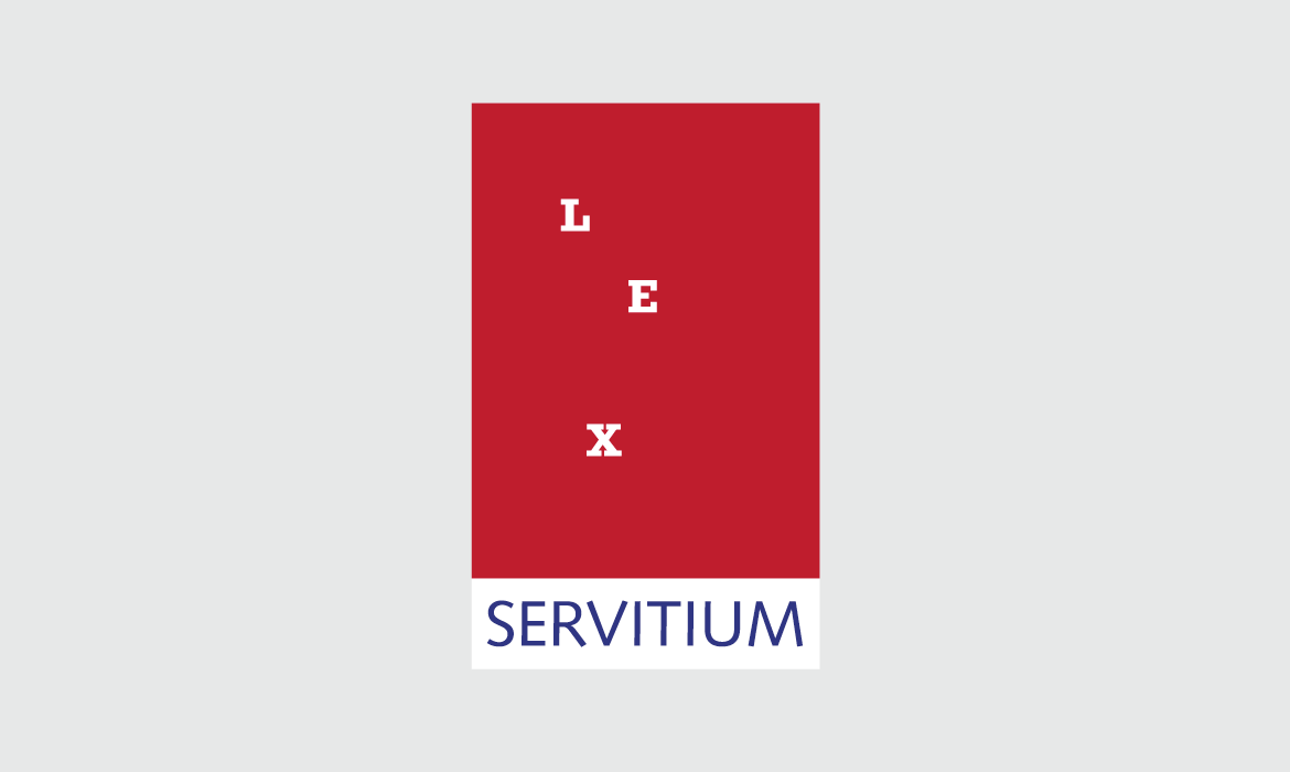
The logo draws inspiration from the slip of paper—dotted with rows of shorthand—that is spewed out by old models of stenotype machines. We used a slab serif font for ‘Lex’ to suggest machine shorthard characters and to convey the mechanical nature of transcription. For ‘Servitium,’ we chose a sans serif to denote accessibility of records and documents by lay people after employing the firm’s services. This combination of typeface classes represents the synergy of the human and the machine in the process.


