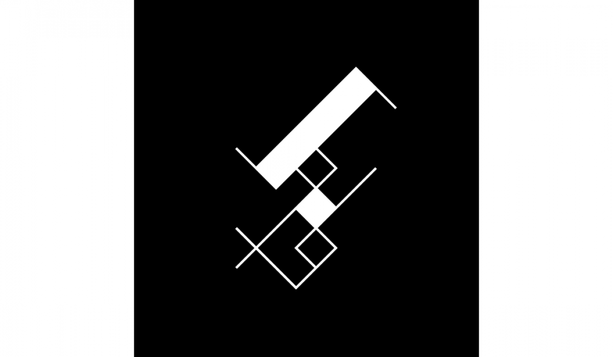
Leon
A monogram for Leon Araneta. The icon is a fusion of blackletter typefaces and alibata (ancient Filipino script) that is then rendered in a minimalist and abstract style.
Read More ›
CGTG Premier Homes
A leading real estate company based in Mindanao, CGTG Premier Homes Corporation was founded by Carlos Gonzalez and Teofisto Guingona III in 2019. They envision a company that will build resilient, masterplanned communities and provide families their quality dream homes, first in Mindanao, then branching out to the rest of the country. The company is a relatively new player in the industry, so the visual identity had to exude trustworthiness and credibility. While it should look professional, it also had to be inviting and provide a sense of comfort. The last names of both founders start with the letter ‘G,’ and an icon was created to emphasize their partnership. The arc symbolizes a safe haven that offers protection, a community where one feels a sense of belonging. The vertical stroke, on the the hand, represents houses and buildings. The geometric construction of the monogram helps identify CGTG Premier Homes as a real estate and architectural company that prides itself on its quality, innovation, and technical excellence.
Read More ›
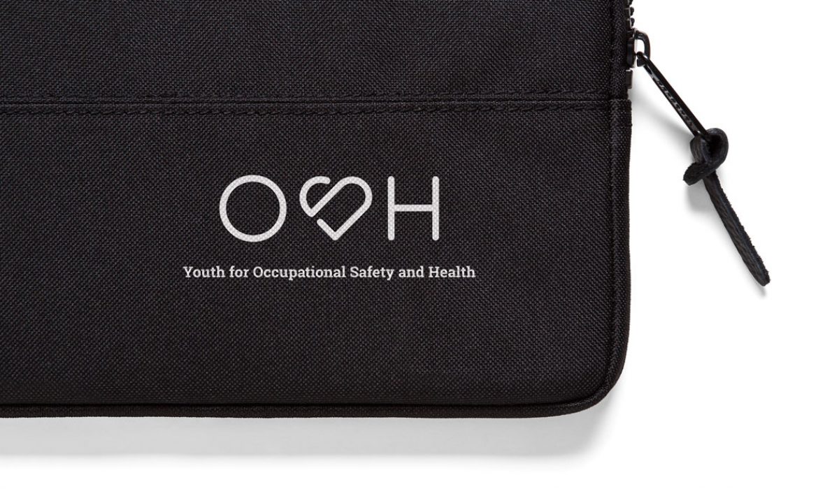
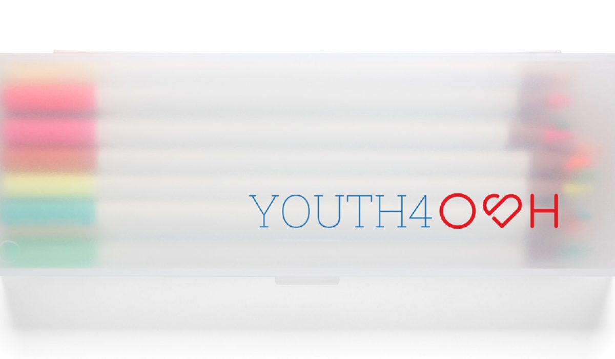
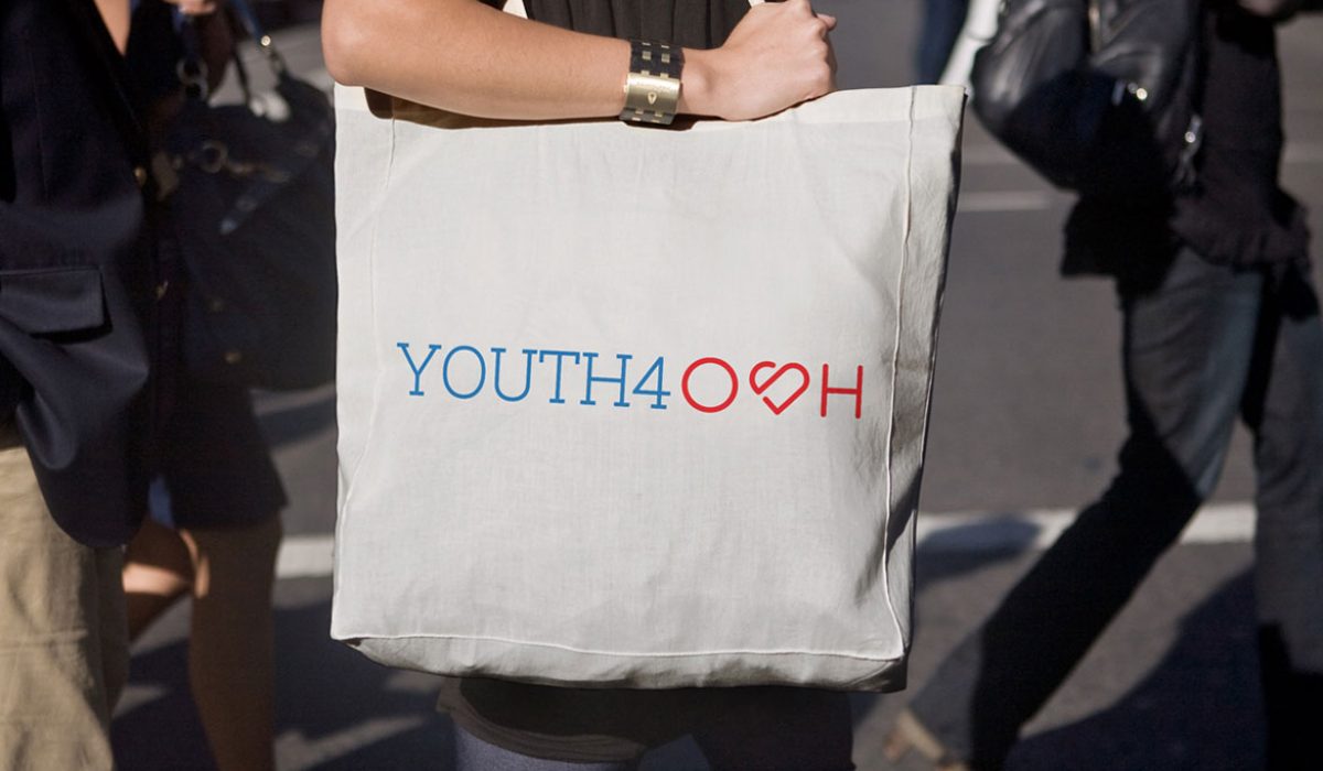
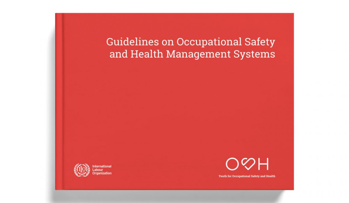
Youth for Occupational Safety and Health
Youth 4 OSH: Occupational Safety and Health for Young Workers and Young Employers in Global Supply Chains—Building a Culture of Prevention is a project of the International Labor Organization (ILO) that seeks to address the lack of awareness of workplace safety and worker rights by developing a range of relevant, practical, and user-friendly tools and strategies. The goal of the project is to reduce workplace injuries, fatalities and occupational diseases through preventative safety actions by young workers and young employers in Indonesia, Myanmar, Philippines and Vietnam. To promote the Youth4OSH campaign, ILO put out a call to develop a graphic identifier that will represent the external and online image and purpose of the project’s communication platform. Given that the identified target audiences come from different contexts, the proposed creative strategy was for the design to appeal to the youth but also engage institutional-level actors.
Read More ›
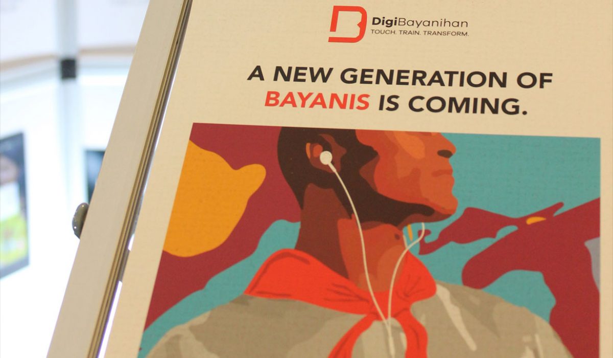
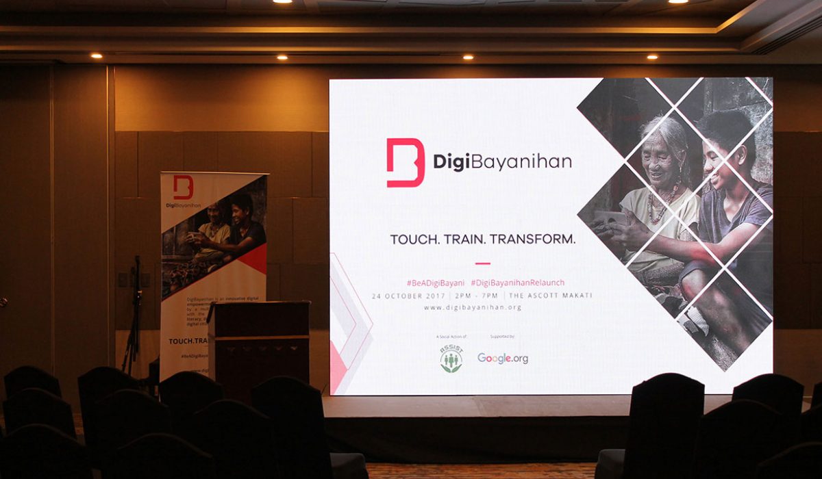
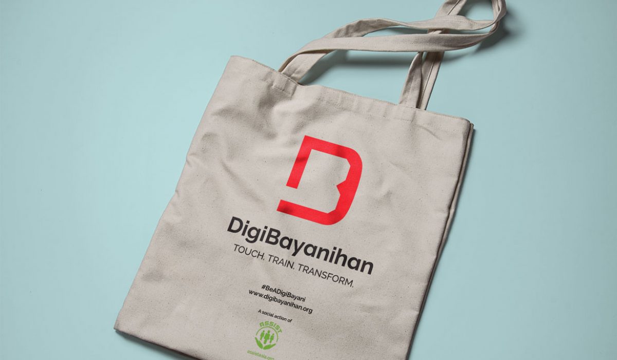
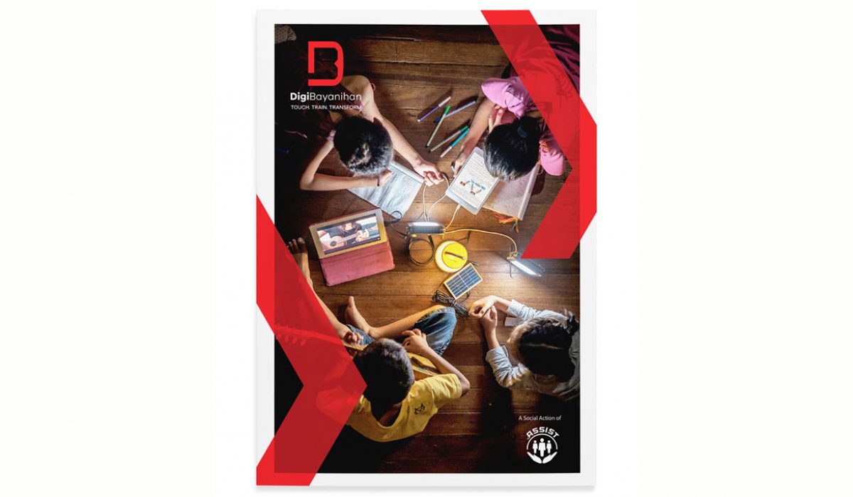
DigiBayanihan
DigiBayanihan is the flagship program of Asia Society for Social Improvement & Sustainable Transformation (ASSIST) Social Actions. It is a digital empowerment initiative that aims to provide digital access, digitally-enabled literacy, and digital inclusion to all Filipinos. Formed by Intel, the Information and Communications Technology of the Department of Science and Technology (DOST-ICTO), and ASSIST in 2014, it was revived in 2017 with the support of Google. ASSIST needed a unifying icon that would represent the programs, activities, and online tools of DigiBayanihan such as The Career Engine and NGO-Connect, and also represent future DigiBayanis (“digital citizens”) that are skilled and confident in using digital platforms to improve their lives. The merging of the initials D and B signifies the partnership between different stakeholders, while the gap on the left of the icon represents inclusion and the opening of doors to opportunities as a result of digital education.
Read More ›
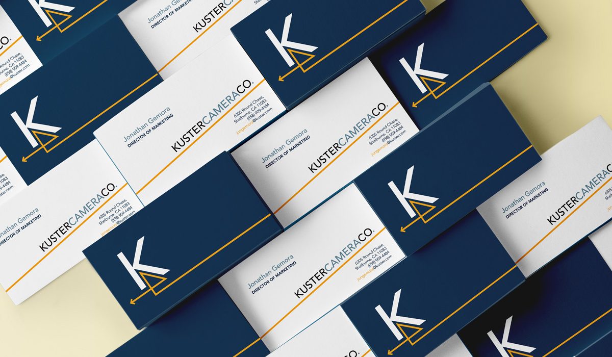
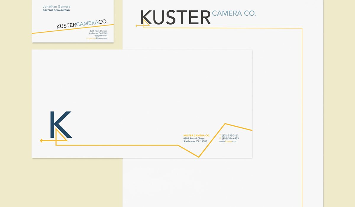
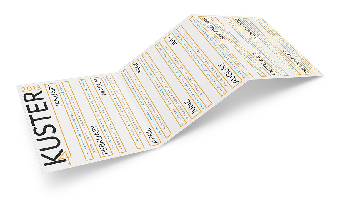
Kuster Camera
This Swiss-made camera is made especially for adventurers and sports enthusiasts who want something "Clearly Extreme."
Read More ›
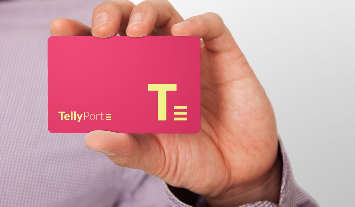
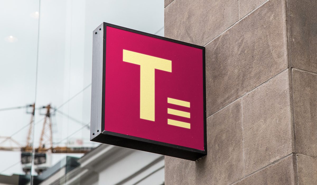
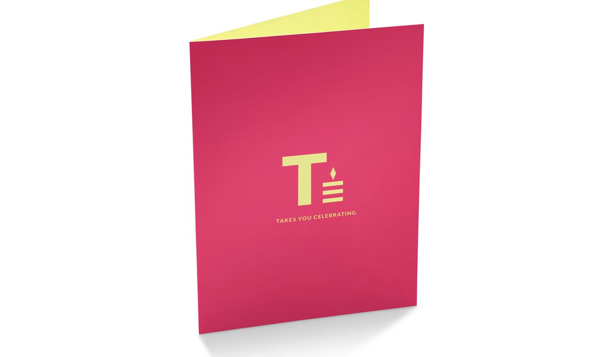
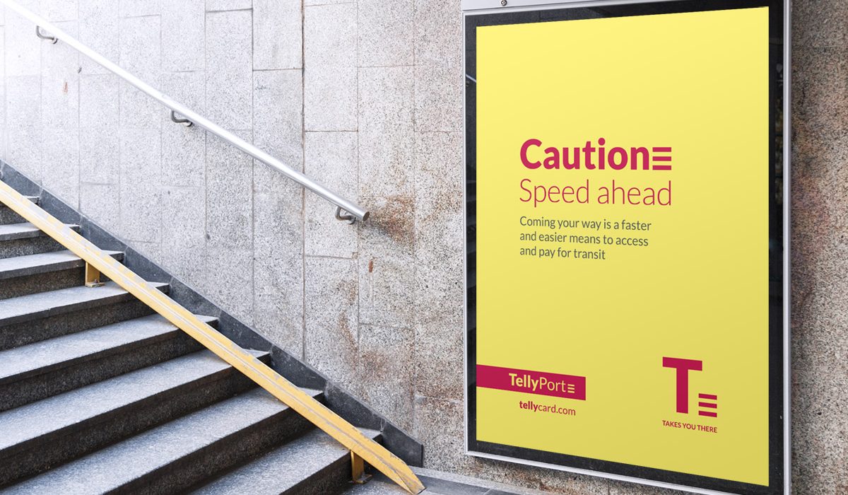
TellyPort Card
The card that "Takes You There" is the country’s first prepaid inter-city bus card that eliminates the hassle of queueing and purchasing tickets.
Read More ›
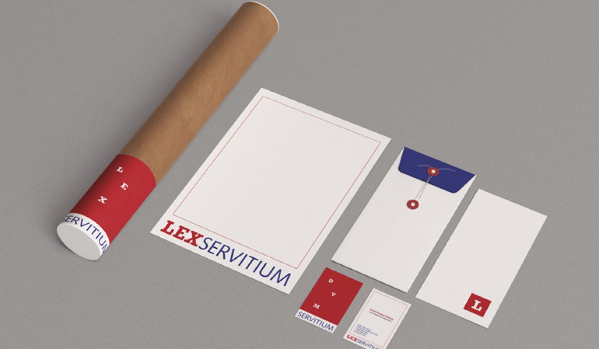
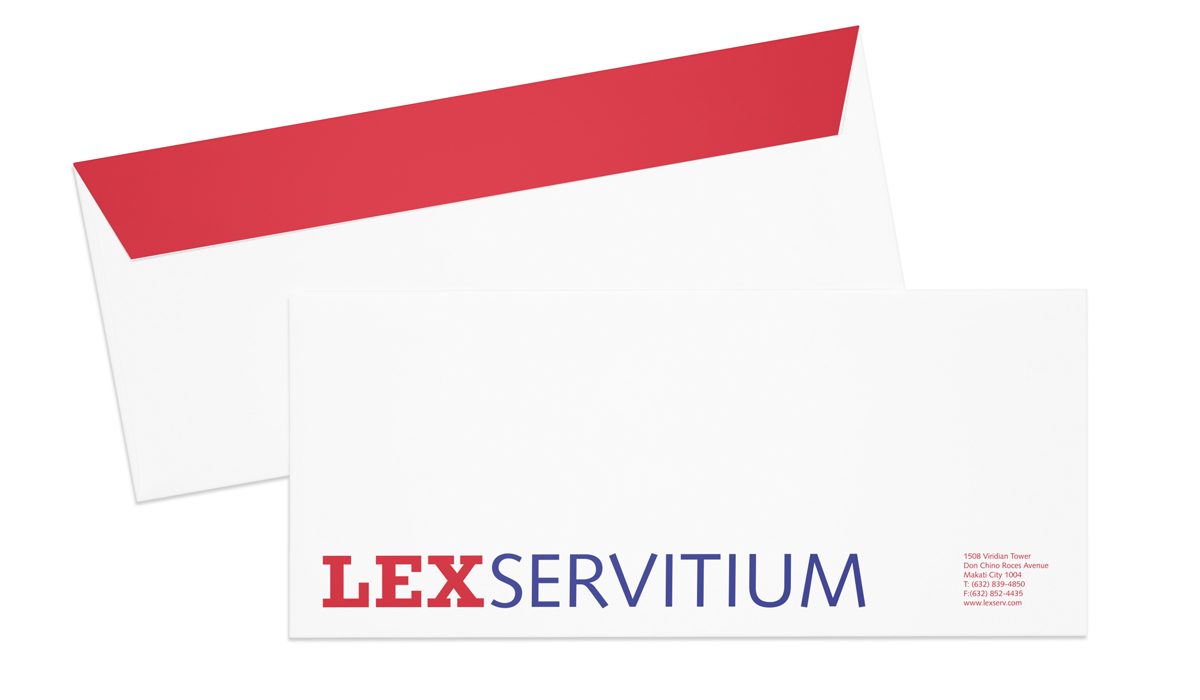
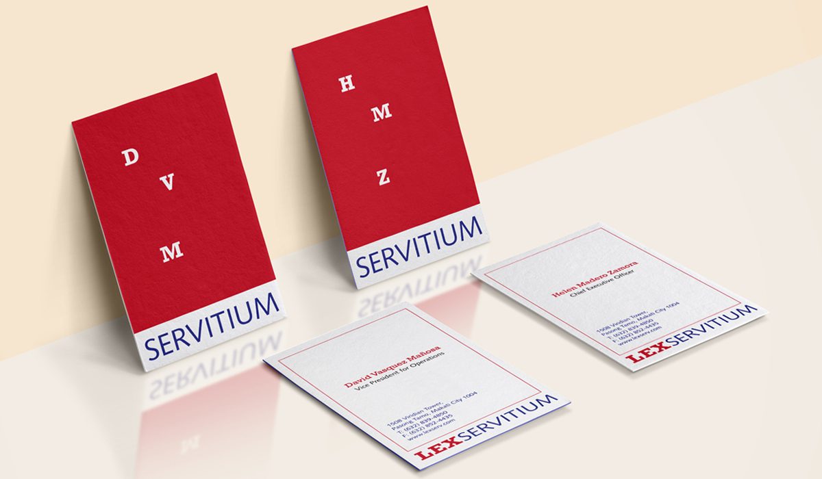
Lex Servitium
Lex Servitium, one of the first legal process outsourcing firms in the country, needed an identity that stood out and clearly reflected their services and strengths.
Read More ›