The Civil Service Commission is a government agency tasked with creating an efficient workforce and environment in the bureaucracy. To this end, it published a guide on how to set up a Strategic Performance Management System (SPMS).
The SPMS serves as a framework for human resource management officers (HRMOs) to assess, streamline and improve standards in public sector management and performance. The agency’s goal is for civil servants to adopt the system so they can perform their best and contribute to the growth of their organizations.
The commission realized that, because of the daunting amount of information presented, the intended audience might be put off from studying and applying it. The layout, therefore, should make the manual inviting and easy to read.
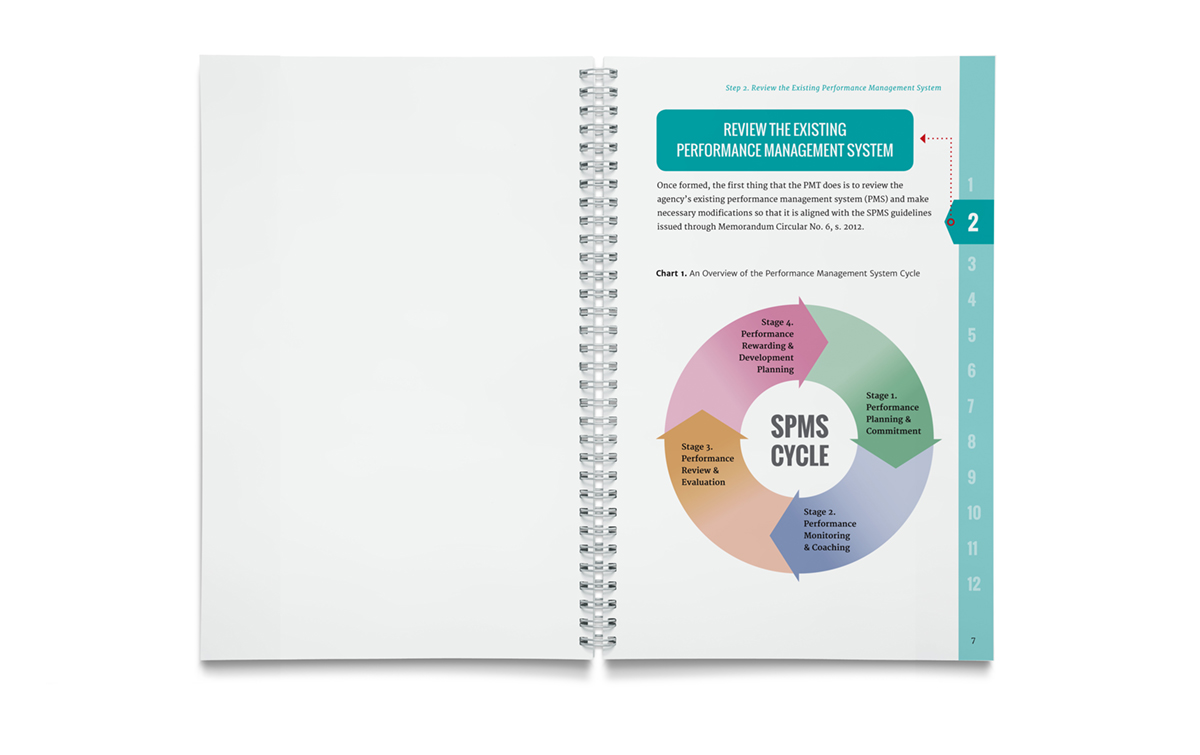
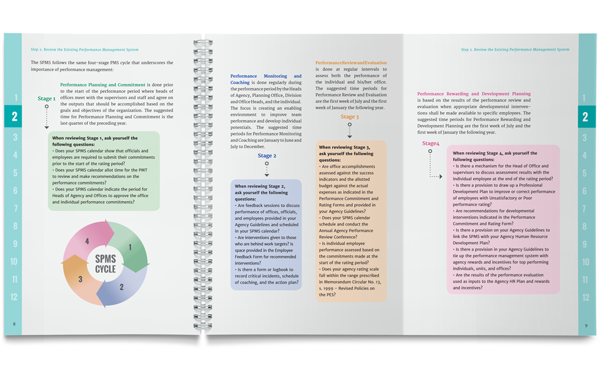
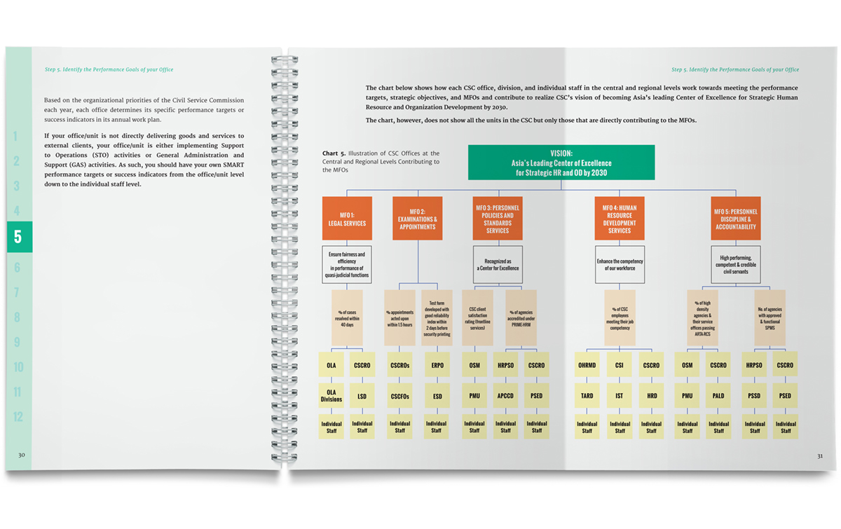
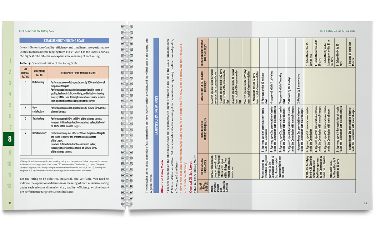
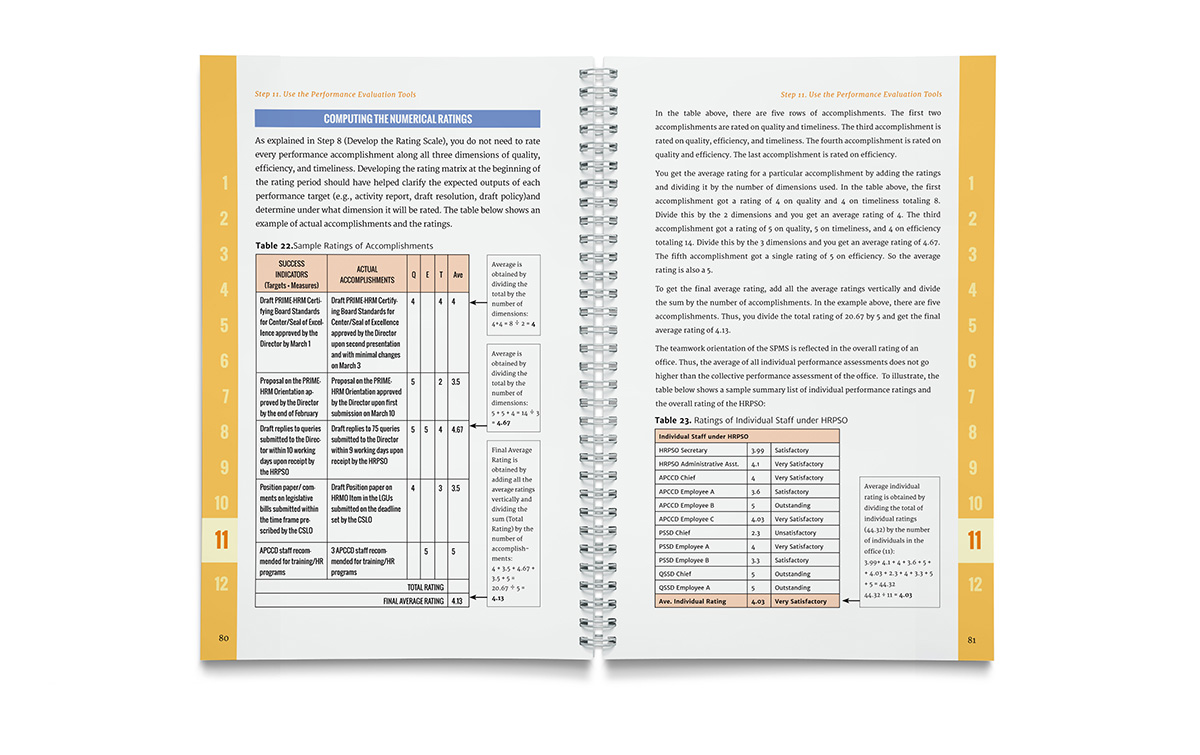
We addressed this concern by dividing the manual based on the four phases of the SPMS cycle and assigning a color palette for each section. We then rendered the charts and graphs in legible and color-coded infographics. Last, to help readers navigate each page, we considered typographic issues such as fonts and font sizes, spacing, and hierarchy.


