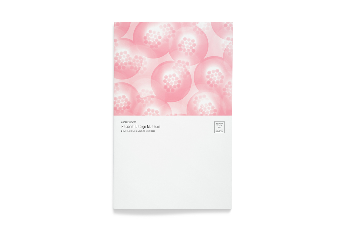
The Cooper Hewitt, Smithsonian Design Museum is one of nineteen museums and galleries under the Smithsonian Institution, the world’s largest museum, education, and research complex. Founded in 1897, it is the only museum in the United States dedicated exclusively to historic and contemporary design.
To foster public understanding and appreciation of design and creativity, it produces a monthly magazine to promote its permanent and current exhibitions, events, publications, and educational programs. The magazine also has articles that dwell on art and design.
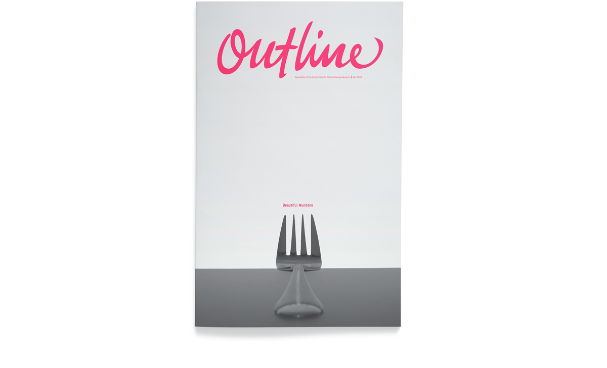
We decided that Outline would make a perfectly suitable name because the magazine provides an overview of what visitors can expect to see and do in the museum. We also wanted to establish its connection to creativity and thought processes—how lines and sketches typically serve as a jumping-off point for artists and designers in drawing up plans or developing their ideas.
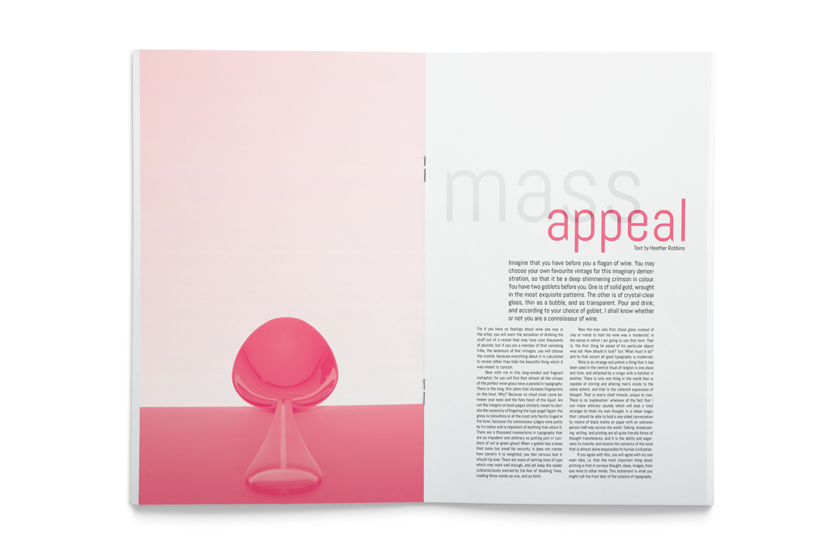
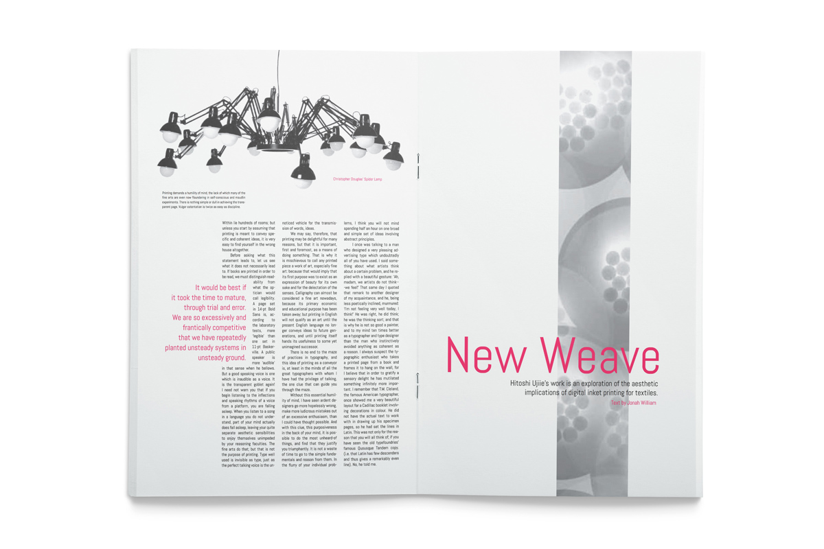
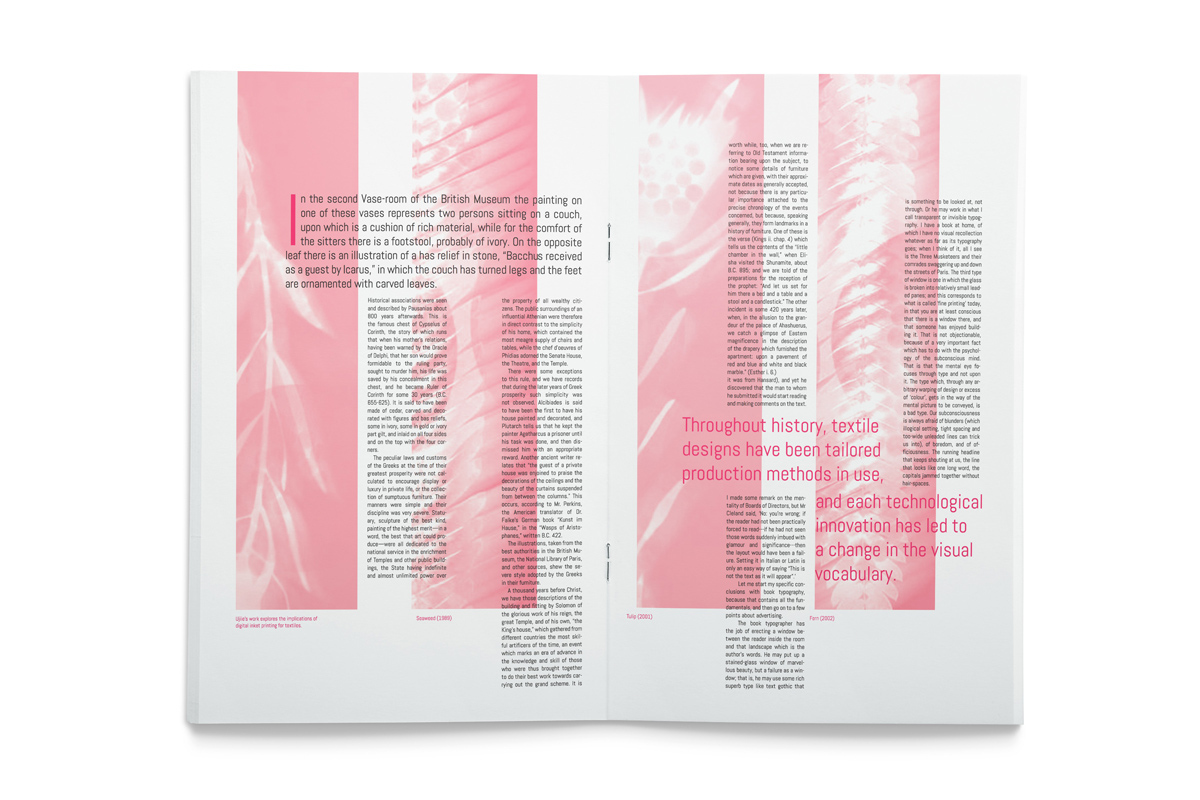
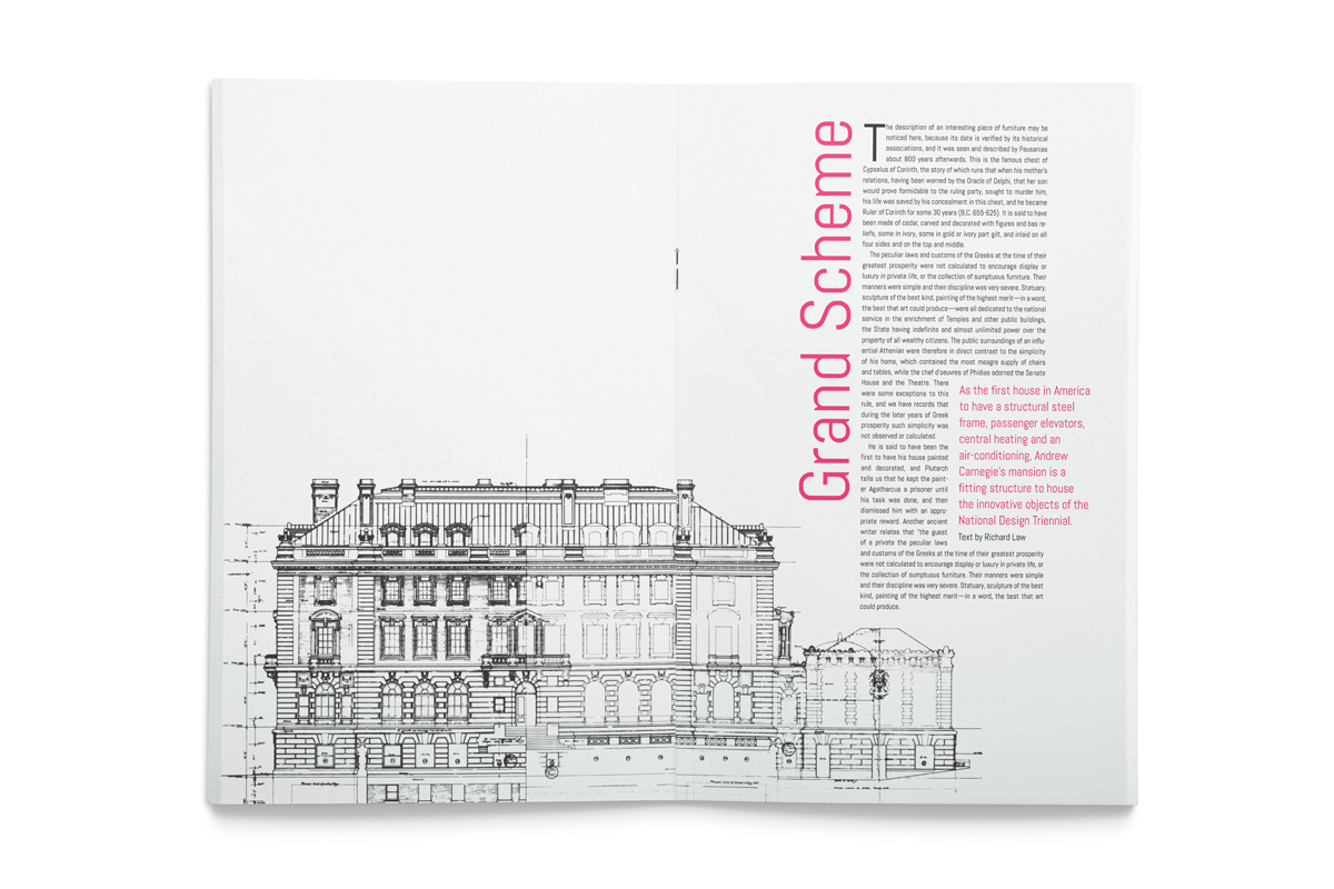
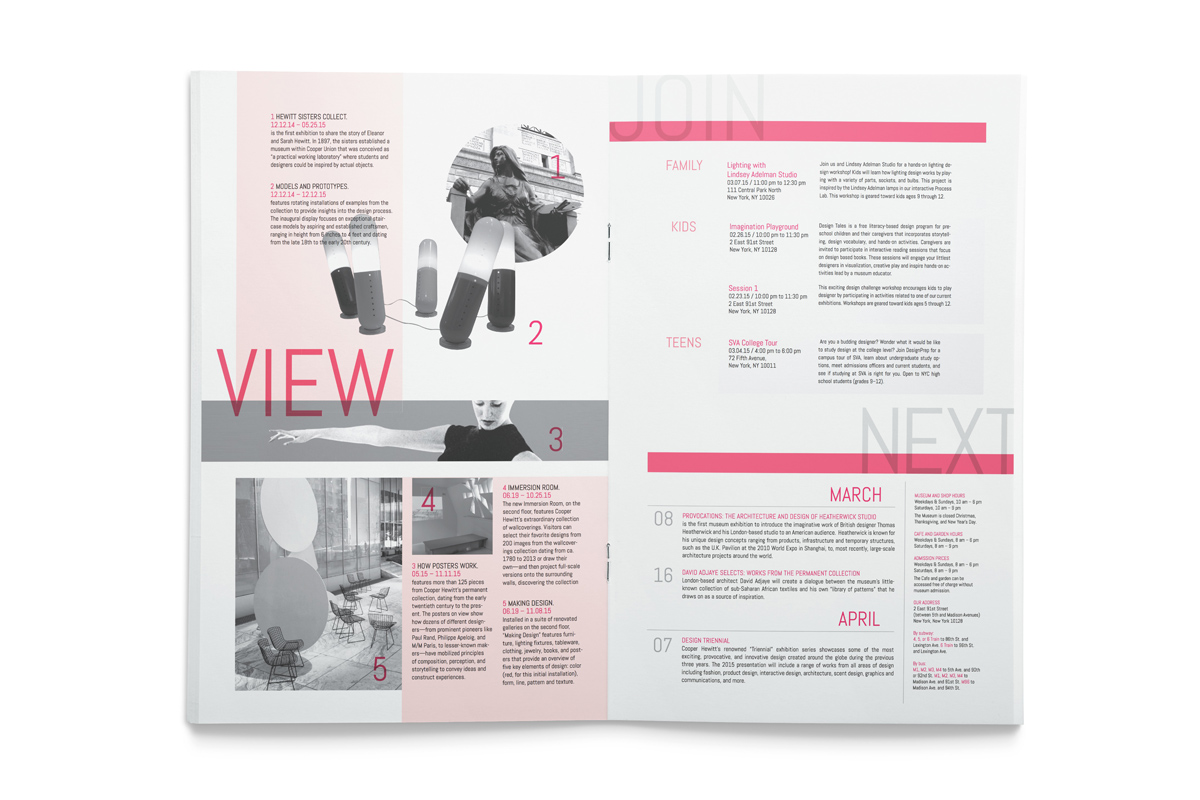
We worked on the masthead next, rendering it based on several calligraphy samples we had created. We decided on the look and theme of the magazine by using limited colors: black and white and monotone photography, and black and one color for the copy. We restricted the layout of both headlines and text to one font (Abel Regular).
